
Simple Website Improvement Hacks That Will Revolutionize Your Marketing
How to Enhance Your Website & Transform it Into a Conversion Machine
Your website should be your most dynamic marketing asset. It’s the ultimate salesperson—the one that never sleeps, never takes a vacation, and that (if built correctly), can convert leads at any time of the day, anywhere in the world!
With this in mind, it’s imperative that businesses constantly ask critical marketing questions related to website optimization. Whether you are working with an older website, or you’ve just invested in a brand new, expensive redesign, the key questions remain:
- How can I improve my website traffic?
- Which website tips can help maximize usability?
- Why is my bounce rate higher on some pages than it is on others?
Strategic website improvement starts with innovative technology that we call usability conversion analysis (UCA). This refers to the ability to measure user engagement on a very precise, scientific level by studying website analytics for both desktop and mobile. Most companies never figure out these secrets to website improvement because they never commit to analyzing website data.
In this article, we’ll outline a couple of the goals you should maintain for your site and provide you with some tips for transforming a good website into a “great” one.
How to Improve a Website: Two Important Goals to Keep in Mind
According to CoSchedule’s Marketing and Management Report for 2019, marketers that set clear goals are 376% more likely to report success.
Making website improvements is one concrete way to help reach your marketing goals. But, before we can go in and make any wholesale changes, we have to first know how your current visitors are engaging with your website and your marketing.
Goal Number One: Maximize Usability/User Experience
Building your website right is really important. Well-built sites offer users an easier, more intuitive experience, which also leads to higher conversion rates.
Are there parts of your site that are confusing for visitors? Using tools like heat and scroll mapping (we’ll talk more about these later), we can watch users’ movements on a website in real-time. This allows us to determine what parts of the site are holding people up from engaging in the ways we want them to. The goal is to make changes that would then improve website usability.
Sometimes there are simple fixes that can be made for critical issues. For example, the following three categories are prime areas for quick improvements.
- Analyze Your Call-to-Action Button
According to statistics compiled in Go-Gulf’s Website Usability Infographic, 70% of small businesses do not have clear calls to action (CTAs) for anything on their homepage! It’s time to take a second look at your placement, size, color, and every other aspect of your CTAs. Could you make them more obvious or more inviting? Are there other items on your pages that look like buttons, but are not clickable? Eliminate confusion and make it clear what you’re asking your users to do. - Add Contact Info
The same Go-Gulf resource estimated that 44% of website visitors will leave a site if contact information is not easily accessible or a phone number is not listed. Take a few minutes and add contact info to more than one location on your website (we recommend in your header or footer and also on the contact page). - Analyze and Adjust Form Fields
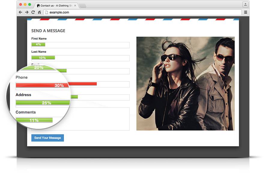
Placement, length, and required fields are all important factors to consider when analyzing website forms. There are a few adjustments that can be made to optimize lead generation forms. This includes making forms begin above the fold, including a compelling CTA, and having a privacy policy displayed.
Goal Number Two: Keep Users on the Page Longer
Another way of stating this is to have a goal of reducing bounce rate. Is your website built in a way that encourages visitors to continue scrolling and reading more? Using heat mapping to check scrolling trends, we can understand how far down the page your site visitors are willing to go to see more information.
If your site is losing people before they reach critical calls-to-action, or before they can view helpful video content, then we know some things need to be changed. Sometimes we need to improve website content itself. Other times, it’s more about placement of the content or spreading items out to include more whitespace on the page.
Why Website Improvement is a Lot Like Baking a Cake
Even a good website can always be improved to tighten up your buyers’ journey and increase conversion. We like to use a basic website design audit checklist:
- Identify the pages on your site that are visited most
- Grade each website page using data from step one
- Add improvements to your pages where needed
Zoom Out
Looking at the big picture, we want to study your conversion funnels to determine which pages of your site are already converting best. We’ll continue to optimize those pages and also build attribution pages that will help lead even more traffic to those already highly-functioning pages.
For the pages that aren’t functioning well, it’s important to look closely at the three categories of potential edits that were mentioned in the section above. Beyond that, every little detail of how your pages are laid out, what content they include, the verbiage you use, etc. is up for improvement in this audit process.
Zoom In
When we zoom in, we have to get detailed in the analysis. We view our clients’ key performance indicators (KPIs) as the end product we’re trying to achieve. But, we liken the process of achieving those KPIs to the process of making a cake. When you’re baking, every ingredient matters.
The process of website improvement is very similar to following a recipe. The comprehensive effort is made up of a bunch of small “ingredients” that all make their own important impact. These small goals are measured by percentages that allow us to see which specific parts of pages are leading to either the success or failure of the page overall.
We want to make changes based on maximum data so that we don’t waste any time guessing. We’d also never want to remove something that is actually working or miss something significant that is causing visitors to leave or be confused. But, in order to make specific, informed changes, we need specific information!
Did you find us with the keyword:
Website Improvement
Case Study on How to Improve Website Usability & Functionality
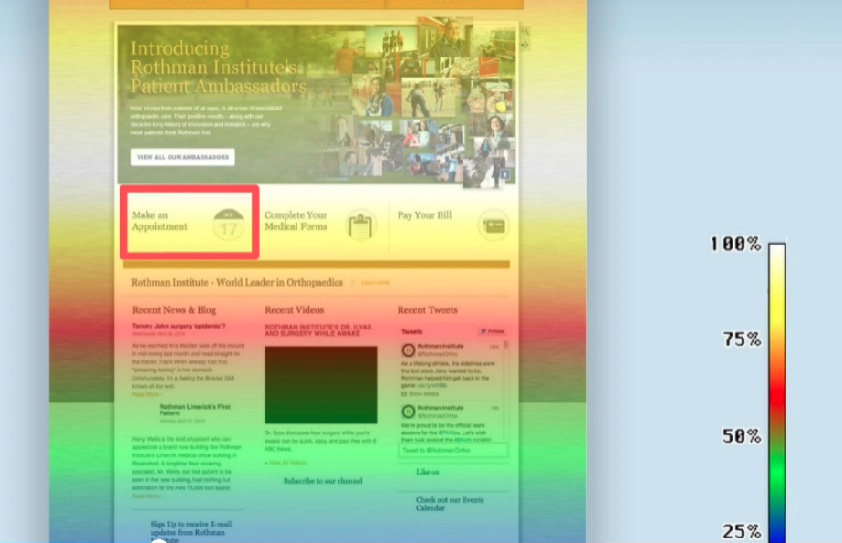
When we were tasked with helping the fourth largest orthopedics practice in the U.S. (Rothman Orthopaedic Institute) generate as many new appointments as possible, we knew that we had to start with an audit of their website to see what was working and what wasn’t.
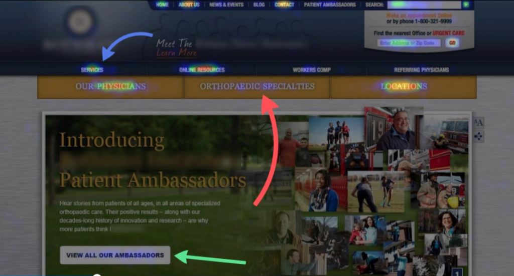
What we found surprised us. Instead of clicking on what seemed to be the obvious “Orthopaedics Specialties” button in the middle of the page, users were instead going to the “Services” page. This was not serving our client well since the critical specialties and all the calls-to-action were sitting on specialties pages that visitors were not frequently accessing.
Also, we noticed that not many users were clicking on the ambassador videos that were featured on the home page. Our client spent over $250,000 on those videos, so this was important data for them to have as they considered similar investments in the future.
Heat Mapping
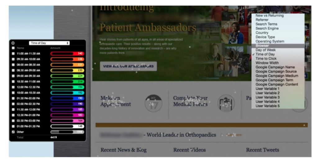
You might wonder how we knew all of this helpful information. Data like this comes to us courtesy of technology called heat mapping, which shows us exactly where users’ mouse activity is happening on the page. In the places where their mouse is moving and hovering, we know that the engagement with those parts of the site is higher.
Click Mapping
With the right tech in place, every click that happens on a site can be accounted for by gray dots that are categorized by color filters. For this client, we analyzed clicks according to:
- New visitors
- Returning visitors
- Referrals
- Search engine
- Search terms
- Country
- Device type
- Operation system
We were able to analyze our client’s site to this level of precision in order to determine the best way to reach each buyer persona and encourage maximum engagement and conversion. The adjustments we made, along with an extensive push for increased organic blog traffic, subsequently led to 33k new appointments made via the site, valued at upwards of $10 million in a single year!
Getting Started
Using the data accumulated through the usability conversion analysis, we can improve website design and functionality, truly transforming a website, making it the dynamic marketing asset it was meant to be!
In addition, we utilize A/B testing to follow up on every change we make. We prefer for the data to lead the way, letting the numbers do the talking. And, only keeping adjustments that are verifiably benefiting our clients.
Interested in discussing how to implement website improvement that can transform your marketing? Fill out this simple form to request a free consultation with our marketing team! We’d love to help you enhance your website and finally reach your marketing goals.